about
Architecture is often presented as precise, polished, and complete—but every compelling image begins with experimentation. Imperfct was built around the belief that creative imperfections are not mistakes to hide, but essential parts of the process.
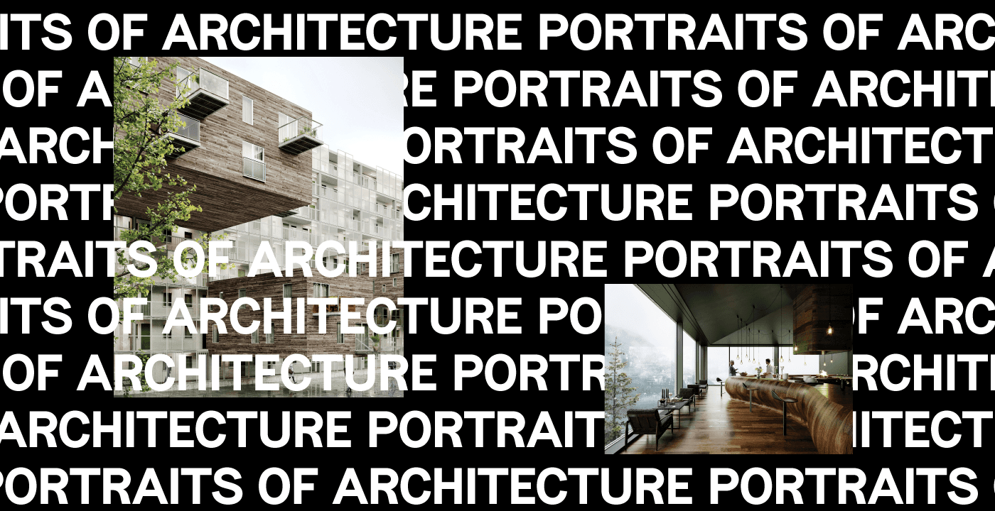
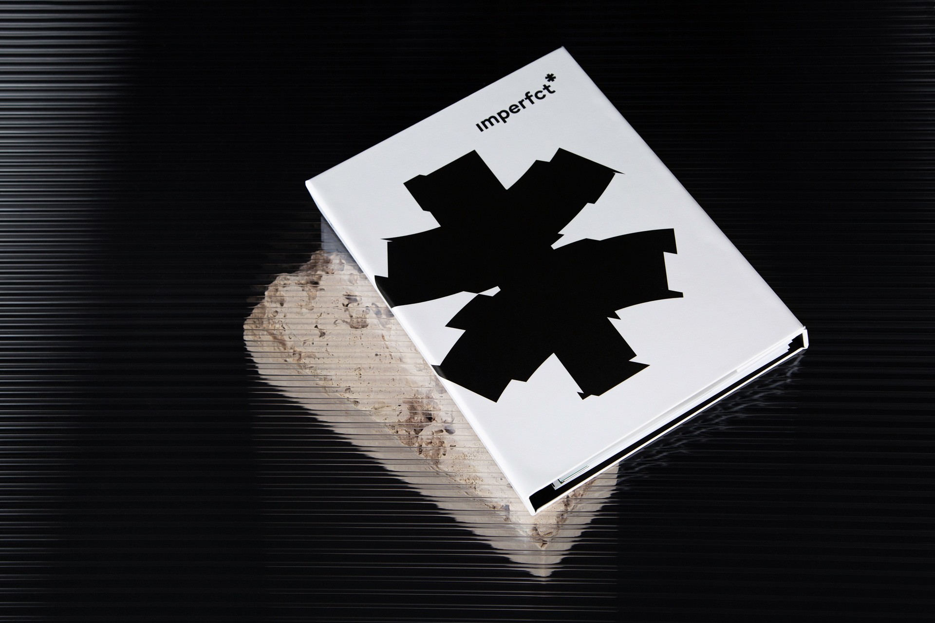
The identity embraces the tension between structure and disruption. Clean typography and architectural layouts establish order, while fragmented forms, distorted graphics, irregular compositions, and the intentionally missing “e” introduce an element of unpredictability. The asterisk becomes a symbol of that interruption: a mark of something unfinished, evolving, and open to interpretation.
I created a flexible visual identity that reflects both the technical discipline and experimental character of the studio.
The wordmark was intentionally reduced to “imperfct,” turning the missing letter into a memorable expression of the brand’s philosophy. A modular symbol—constructed from a vertical form and fragmented asterisk—can be rearranged, distorted, enlarged, blurred, or broken apart without losing recognition.
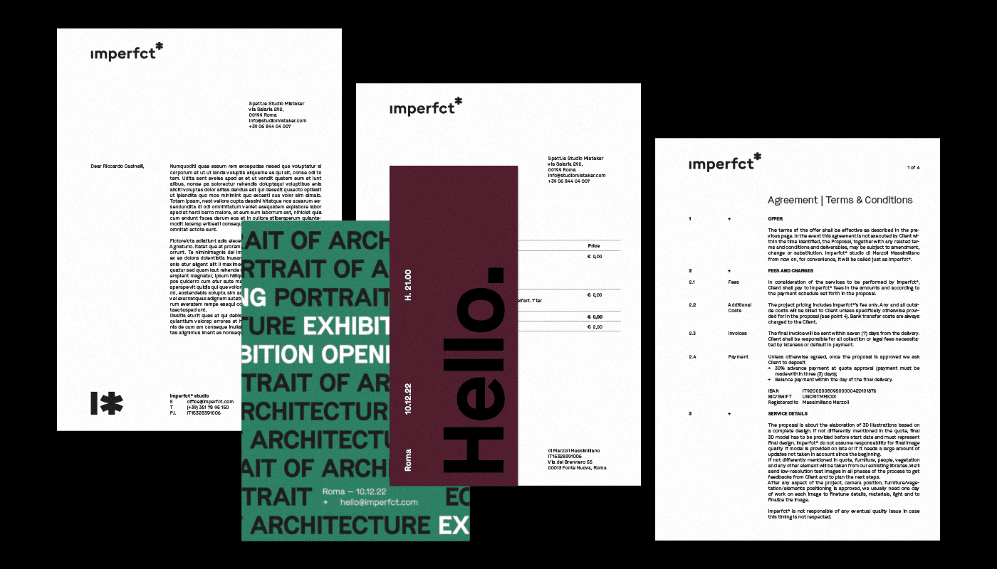
A restrained foundation of black and white is supported by architectural tones inspired by material, landscape, and atmosphere. Oversized typography, shifting compositions, and image-led layouts allow the system to adapt across stationery, presentations, publications, social media, and project imagery.
The result is an identity that feels precise without becoming rigid and expressive without competing with the studio’s work—positioning imperfct as a practice where technical control and creative experimentation coexist.
credits
Designer Brand
RUSLAN T
3D Visualization
Terran Films